
Most Commonly Asked Python Usecases - Part 3 (Data Visualization)
- Jul 19, 2021
- 3 min read
Updated: Jul 26, 2021

Photo by Hitesh Choudhary on Unsplash
Hi All! Hope you all had a great weekend!! This is the part 3 of the most commonly asked python usecases. Last week, we saw in Part 2 python usecases on Pandas & Part 1 python concepts such as lists, list comprehensions, numpy array, sets, dictionaries, etc. Visualization is the most important step in Exploratory Data Analysis. And so this week, we are going to look at Data Visualization usecases that uses Matplotlib and Seaboarn Libraries. Dont Miss the bonus content below.
Most commonly asked Python topics and use cases
1. Visualize the distribution of the input variable:
import matplotlib.pyplot as plt
%matplotlib inline
import numpy as np

x = np.array([10,10,30,20,20,45,34,30,50,10])
plt.hist(x)
plt.title("Histogram Plot")
plt.show()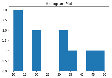
As you can see here, there are bins formed and data is grouped accordinged to the bins. This way, we can find the distribution of the variable of interest.
2. Show a sample plot using an x and y values generated from arange function:
import matplotlib.pyplot as plt
%matplotlib inline
import numpy as np
x = np.arange(0,10,2)
y = x*x

plt.plot(x,y, 'g*--')
plt.xlabel('x-axis')
plt.ylabel('y-axis')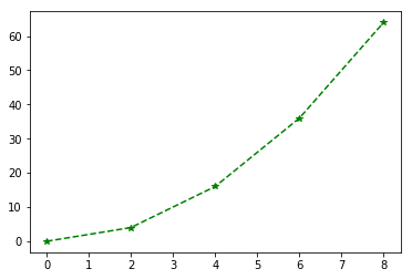
The above plot uses sample X data and plot the data with X & Y based on the Y calculation. Similarily, we can plot sine and cose fucntion plots.
3. Visualize multiple plots in your canvas:
import matplotlib.pyplot as plt
%matplotlib inline
plt.subplot(1,2,1)
plt.plot(x,y,'g*--')
plt.xlabel('x-axis')
plt.ylabel('y-axis')
plt.title('Plot 1')
plt.subplot(1,2,2)
plt.plot(x,y2,'ro-')
plt.xlabel('x-axis')
plt.ylabel('y-axis')
plt.title('Plot 2')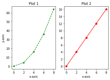
The above plots shows two plots in one row. Likewise, we can place more plots by assigning number of rows and columns.
4. Visualize the correlation between variables:
import seaborn as sns
#heatmap
df = sns.load_dataset('titanic')
corr = df.corr()
sns.heatmap(corr, annot=True) #using the inbuilt seaborn data 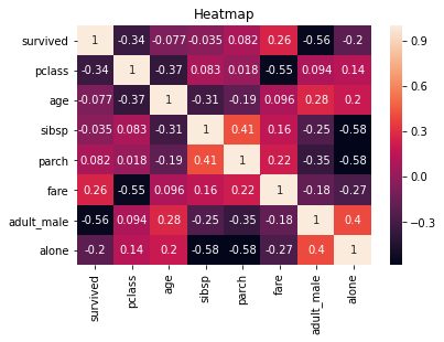
In the above seaborn plot, we can see which variables are high correlated. In the plot, we can see that survived class is correlated positively is fare variable.
5. Visualize univariate analysis on the variable (distribution of a continuous variable):
import seaborn as sns
df = sns.load_dataset('titanic')
df['age'] = df['age'].fillna(0)
sns.distplot(df['age'])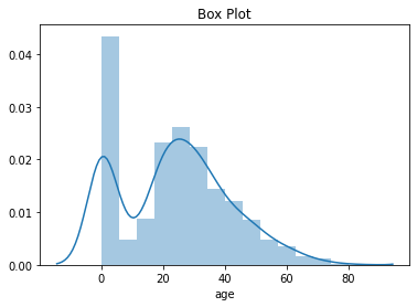
The above seaborn also shows the density distribution that makes it even easier to visualize the distribution of the data. And, it is not a prefert bell shaped curve i.e. Normal Distribution.
6. Visualize the frequency of the categorical variable:
import seaborn as sns

df = sns.load_dataset('titanic')
sns.countplot(df['sex'])
The countplot is mainly used to find the frequency of the categorical variable. In the above plot, we can see that population is mainly consists of Male.
7. Visualize the proportions of the populations:
import seaborn as sns

df = sns.load_dataset('titanic')
sns.barplot(x='class', y='fare', data = df, hue = 'who')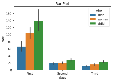
Similar to the frequency plit, the population proportion need to be analyzed while data preprocessing. In the above plot, we can see the first class member are highly priced. This shows the dataset seems logical.
8. Visualize distributions to compare data between two groups:
import seaborn as sns
#boxplot
df = sns.load_dataset('titanic')
sns.boxplot(x='survived', y='age', data=df).set(title = 'Box Plot')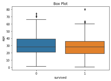
The boxplot shows the minimum, maximum, 1st quartile and 3rd quartile. This plot above is used for better understanding of the distribution of a given variable between two groups. Additionaly, we can see there are some outliers within the data.
9. Visualze a bivariate distributions of the dataset or relationship between variables:
df = sns.load_dataset('iris')
p = sns.pairplot(df, hue='species')
p.fig.suptitle("Pair Plot", y = 1.08)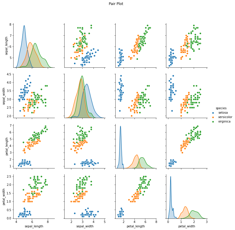
Pairplot is similar to heatmap however if we need to find individual correlation plots for each variable and its relationship. Pairplot is widely used. In the above plot, we can see that for each species (colour-coded) are plotted with the dataset variables.
Bonus:
Matplotlib library makes ues of other libraries such as pandas and numpy for plotting purposes. Whereas Seaborn is built on top of Matplotlib and is mostly considered as the superset of Matplotlib.
Using %matplotlib inline to the code allows us to plot the matplotlib plots without using plt.show() code.
Violin plot of seaborn library is a combination of boxplot ad kernel density estimate.
Always make sure to provide plot title, axis names and legends (if needed) as it can help in better understanding.
Best Sources:
Part 4 will be out next week. If you like this content, please like, share and subscribe!!
Top Viewed articles:


Comments